We have a new look! We’re thrilled to announce the launch of our fresh brand identity, unveiled at our Gala! This new identity takes us “outside of the box” of our old identity and embodies the essence of who we are and who we strive to be with an emphasis -in both words and design- on our multigenerational approach and impact.
LOGO
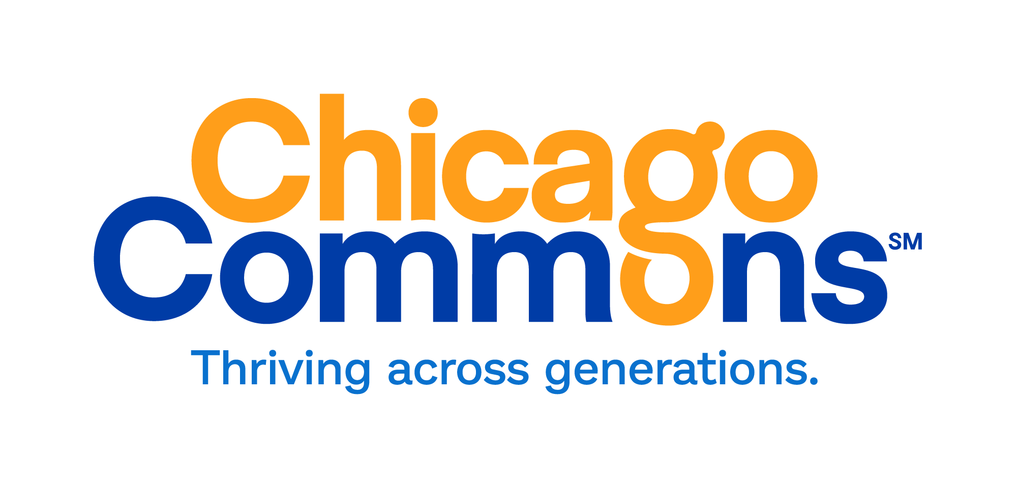
Our new look captures the heart of who we are, emphasizing our multigenerational approach and impact. The bold “G” nods to our past tagline, “GO Further,” and our new one, “Thriving Across Generations.”

COLORS
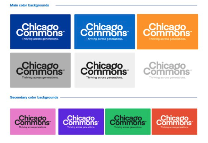
While we’ve retained our familiar color scheme, you’ll notice our blue and orange hues are now even more vibrant. This dynamic new look symbolizes our commitment to empowering families to thrive across generations!

CUSTOM “G” FOR GENERATIONS
The bold “G” pays tribute to the “G” in “GO Further,” our past tagline. It also represents the “G” in “Generations” from our new tagline, “Thriving Across Generations.

At Chicago Commons, our mission is clear: we empower individuals, families, and communities to overcome poverty and systemic barriers, embrace opportunities, and enable them to thrive across generations.
Visit our new website: chicagocommons.org
Thank you for your continued support, and here’s to the next 130 years of Chicago Commons. Cheers!


